
When Policy Change Outpaces Analysis
Building Two SNAP Informational Tools without Writing Code

The SNAP Information Gap
The past seven months have brought a slew of changes to the Supplemental Nutrition Assistance Program (SNAP— colloquially known as “food stamps”). Some of these changes would have been ground shaking to the program on their own, but the volume and frequency of them has left state administrators and program advocates scrambling to keep up.
SNAP work requirements have shifted drastically to affect millions more households, suspending benefits unexpectedly. Almost two dozen states are changing the definition of what food can be purchasable with your EBT card, with more announcing new waiver applications monthly. The question becomes: “how do you explain these changes meaningfully to real people when they’re so frequent?” The “does this affect me?” version is crucial to someone on the program, but creating a thoughtful analysis of these new policies takes time. How do we address this information gap for the public in a world where change has become the constant?
I've been thinking about this question every day for the past seven months. I have the privilege of serving as an AI Resident at Propel, a company whose app helps over 5 million SNAP recipients manage their benefits. I came into the residency as a policy person, far from an engineer, to explore how AI tools can help close the growing gap between the pace of policy change and the people those changes affect. What I've learned has fundamentally changed how I think about the role of advocacy in this moment.
18 States, 18 Different Definitions
At this moment, 18 states have received USDA approval to restrict what can be bought with SNAP benefits. However, the specifics vary wildly: Iowa ties restrictions to their tax code; Arkansas created five distinct categories; what Nebraska calls “soft drinks” isn’t quite what Texas calls “sweetened drinks” or Virginia calls “sweetened beverages.”
I wanted to show this variation and not just describe it in a policy brief that would sit in someone’s inbox. So I opened Claude Code and described, conversationally, what I wanted: a scrollytelling map that walks through the waiver approvals chronologically and lets you click any state to see what they actually restrict drawing explicitly from the official USDA website as a readily available source that anyone can publicly access.
An hour later, I had a working interactive visualization. D3.js map, scroll-triggered animations, clickable state details. I don’t write code. I’ve never used the Scrollama library that handles the scroll triggers. But I could describe what I wanted to see, and I could tell when the result was right or wrong because I understood the policy.
View the SNAP Restriction Waivers Map
The interactive version lets you scroll through the chronological rollout and click any state for detailed restriction information such as implementation dates.
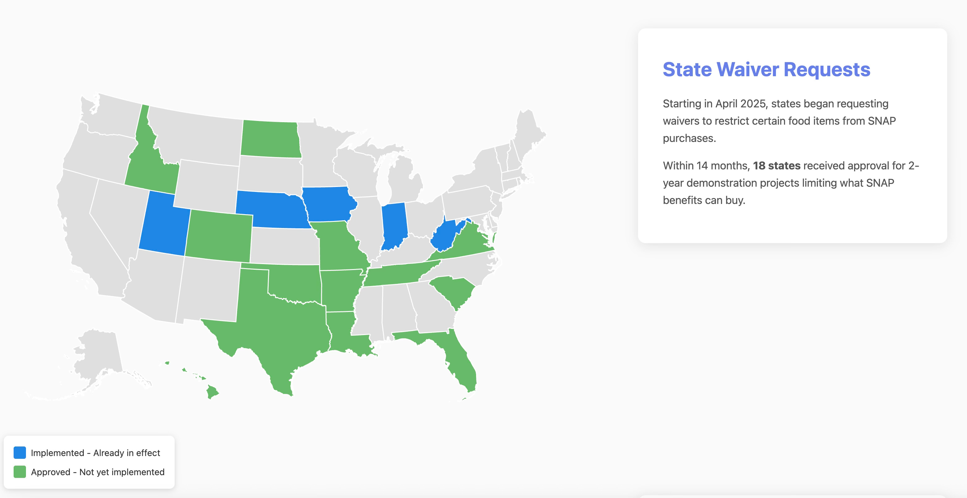
That project taught me that in this era of emerging tech, the hard part is no longer the technology, but rather knowing what matters. Knowing that the definition differences between states. Knowing that advocates needed to see the timeline because implementation dates determine when their guidance materials need to be ready.
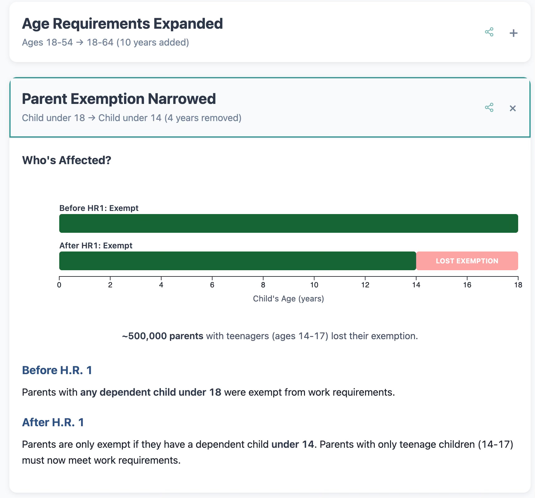
One Policy, Three Changes, Millions Affected
SNAP work requirement changes create this same urgency. However, this project felt more complex than the waivers map. The work requirement changes aren’t one story— instead they’re three distinct changes affecting different populations:
The age expansion pushes work requirements from ages 18-54 to 18-64. That’s roughly 2.5 million people ages 55-64 who are newly subject to requirements they weren’t before.
The dependent care age window narrowing changes the work requirement exemption threshold from having a child under 18 to having a child under 14. If your youngest just turned 14, you’ve lost your exemption. About 500,000 parents are affected.
General exemption categories ended removes exemptions for entire groups. Veterans, people experiencing homelessness, and foster youth ages 18-24 were previously exempt from work requirements. Those exemptions are now gone.
For this, I felt that people don’t need a geographic view but instead they need to know which change affects them, and what it actually means for their situation. With Claude Code I built something different: an interactive card-based explainer with three expandable sections, one for each change. And because I kept thinking about caseworkers and advocates who need to help transmit this information, I made them into shareable cards you can forward via email or text. A legal service advocate helping a 58-year-old client doesn’t need to send them the whole explainer when they can share just the age expansion card with the specific information that’s relevant.
H.R. 1 Work Requirement Changes Explainer
The interactive version lets you view each major change and share cards individually.
Why It Matters
Building these each tool took me about an hour of work with nothing more than Claude code and a GitHub account. The technical barrier for distilling complex information for a broad audience is rapidly evaporating. I don’t say that lightly. A year ago, building either of these would have required hiring a developer, writing a scope of work, going through revision cycles. Weeks or months of calendar time, and real money. Now I can describe what I want in plain language and iterate on it in an afternoon.
This iterates, however, that domain expertise is more important than ever. And, honestly, that’s good news for people who do this work.
The waivers map works because I knew that definition variation between states was the central challenge for advocates.
The HR1 explainer works because I knew that a 58-year-old SNAP participant doesn’t care about the legislative history or the CBO score. They care about one question: “Do I now have to meet work requirements?”
AI tools can generate the code, but they can’t always generate the nuanced judgment about what matters (yet). That’s the part that comes from years of working in a field, talking to the people affected, understanding what they actually need to navigate a system. Understanding why it matters to a human being in crisis.
Your competitive advantage as an advocate was always your domain expertise. What’s changed is that the distance between that expertise and a working, shareable tool has collapsed from months to hours.
Genuine Concerns I Take Seriously
I want to be honest about what makes me uncomfortable, because I think the AI enthusiasm in civic tech spaces has the propensity to gloss over real concerns.
Accuracy matters more here than almost anywhere. These tools deal with policy that directly affects whether people eat. I spent time verifying every data point against primary sources like the actual text of H.R. 1, USDA FNS guidance documents, state waiver applications.
These are communication tools, not legal guidance. The waivers map shows the policy landscape, but it doesn’t tell you whether a specific product is allowed in a specific store because that needs to be completely precise.
I worry about the appeal to authority fallacy more than ever. The same speed that makes these tools possible also makes it possible to build something that looks authoritative but is wrong. A polished interactive visualization carries an implicit claim of accuracy that a rough policy brief doesn’t. The presentation quality that AI tools enable can outrun the verification quality if you’re not careful.
I don’t have a clean answer to these concerns. I just think they need to be part of the conversation every time someone in the nonprofit space talks about using AI tools.
Making This Universal
I’m grateful that my residency with Propel gave me the space and support to learn how to use them, to experiment and fail quickly, and to think deliberately about what kinds of tools would actually serve the people who need them. Propel's environment of being surrounded by people who think deeply about how technology meets real people's lives shaped what I built just as much as the AI did.
But the learning curve to for anyone to be able to do this is not as steep as you may believe. If you’re working on benefits access, food security, or any area where policy complexity is a barrier to the people the policy affects I’d genuinely like to hear what you’d want to build. What’s the tool you wish existed? What’s the data you understand deeply that other people can’t navigate? I want to see this sort of work become more ubiquitous across all sectors that seek to help people thrive.
Joël McClurg is an AI Resident at Propel, exploring how AI can help states and beneficiaries navigate SNAP policy changes following HR1.
Infographics were generated using Claude Code Opus 4.5 This post was co-authored by Opus 4.6.
Agree with your overall points. The apparent authority of a polished presentation is an interesting point. I'd also flag that many nonprofit orgs websites don't allow these sorts of graphics to be embedded, and when they have to be on a separate site (or a github page) that raises additional questions about authority and authenticity.
Two points on the work requirements explainer. The first is that I'm not sure it makes sense to try do to this at a national level, given how nuanced the implementation issues are and how they vary from state to state (e.g. I'm not sure that the volunteer activities need to be for nonprofit orgs in all states). The second is a technical issue -- when I tried to "share" via email, I got text only with no image or link.
-ELB